Branding | Campaign
For this project, I was tasked with creating a brand identity and logo for Chameleon, a start up company based in the Republic of Benin, West Africa. The company’s focus includes tours, experiences and expertise with the logo needing to be versatile, suitable for both colour and monochrome applications, and adaptable for the various sub brands under the Chameleon name.
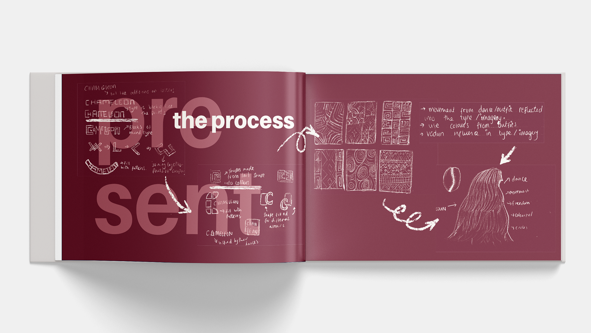
Rather than relying on the literal image of a chameleon, I chose to build a logo concept inspired by Benin’s rich cultural heritage, particularly the traditions of Vodun and the symbolic figure of the Zangbeto.
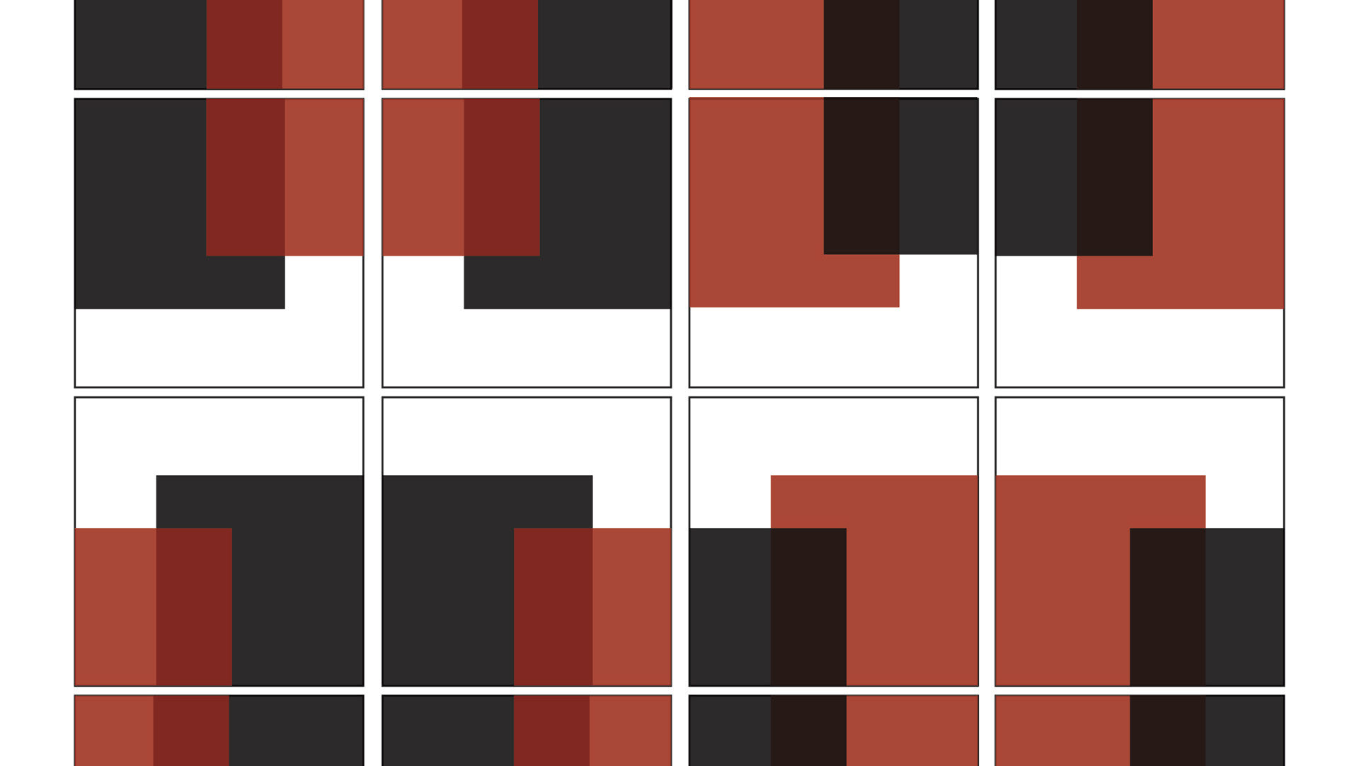
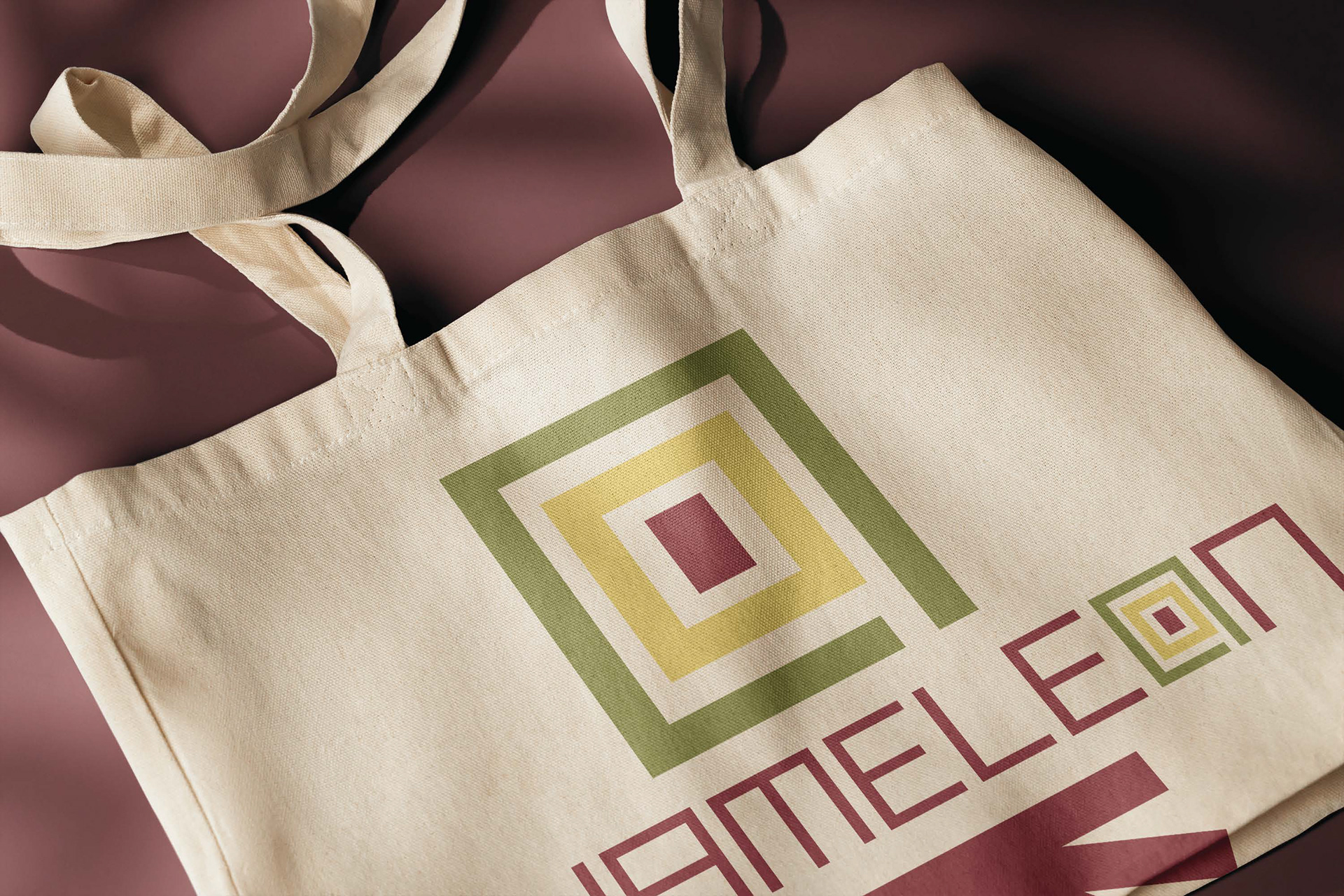
Zangbeto guardians are spiritual protectors whose hypnotic, spinning dances represent transformation, mystery, energy, and watchfulness, qualities that align closely with Chameleon’s brand values of adaptability, movement, and transformation. I abstracted this cultural reference into a symbol composed of layered lines and spiral forms, elements that not only reflect the swirling motion of Zangbeto dances but also subtly echo the coiled tail of a chameleon. These forms also reference patterns found in Benin’s fabrics and traditional designs, adding authenticity and a strong cultural connection to the brand mark.
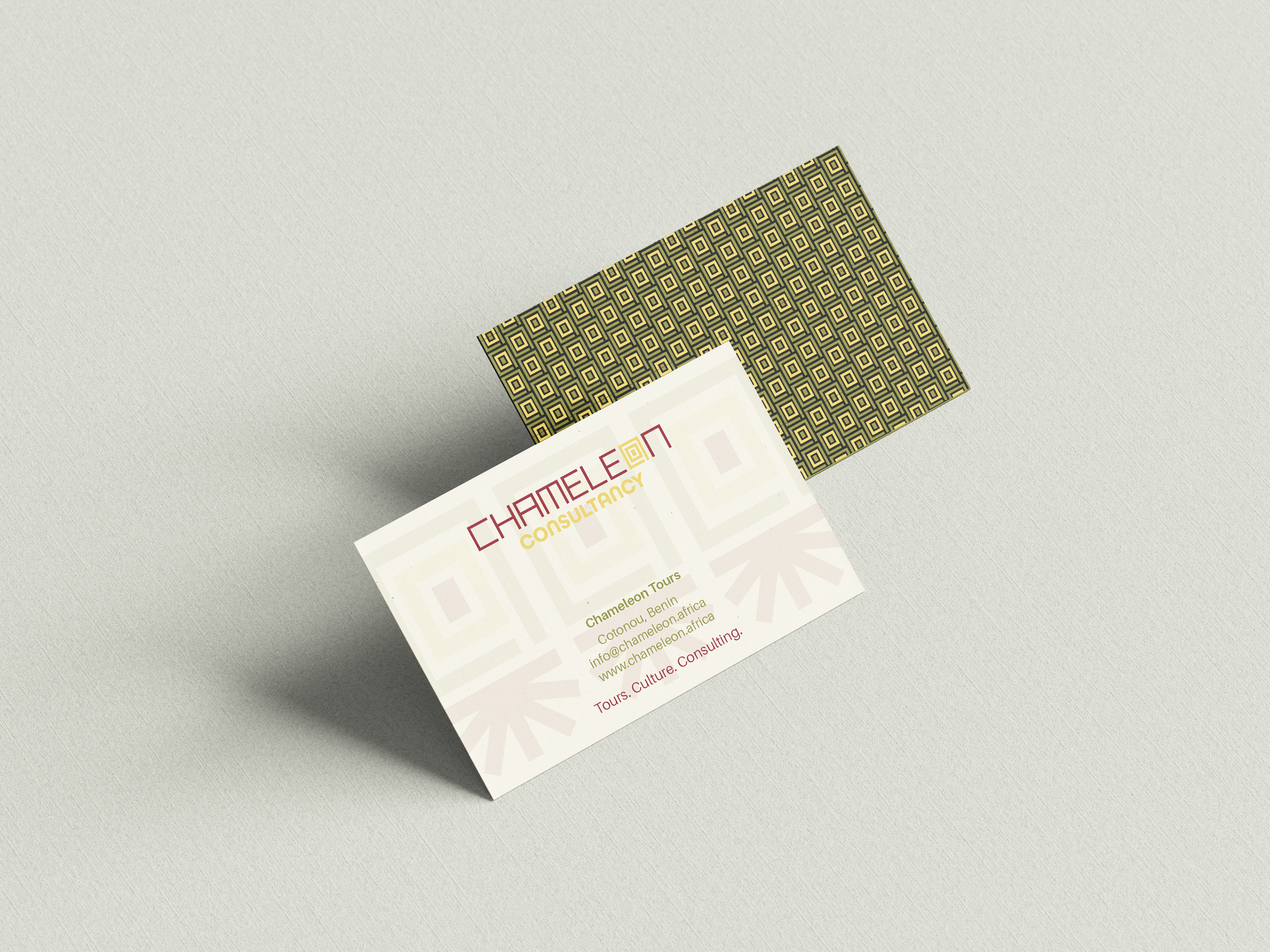
For colour, I drew from a palette inspired by both the vibrant multicoloured textiles of Benin and the national flag’s rich tones. This resulted in a distinctive, culturally grounded colour scheme that can be flexibly applied across sub-brands such as Chameleon Tours, Chameleon Experiences, each assigned a unique colour from the palette to distinguish its role while maintaining unity within the overarching brand.
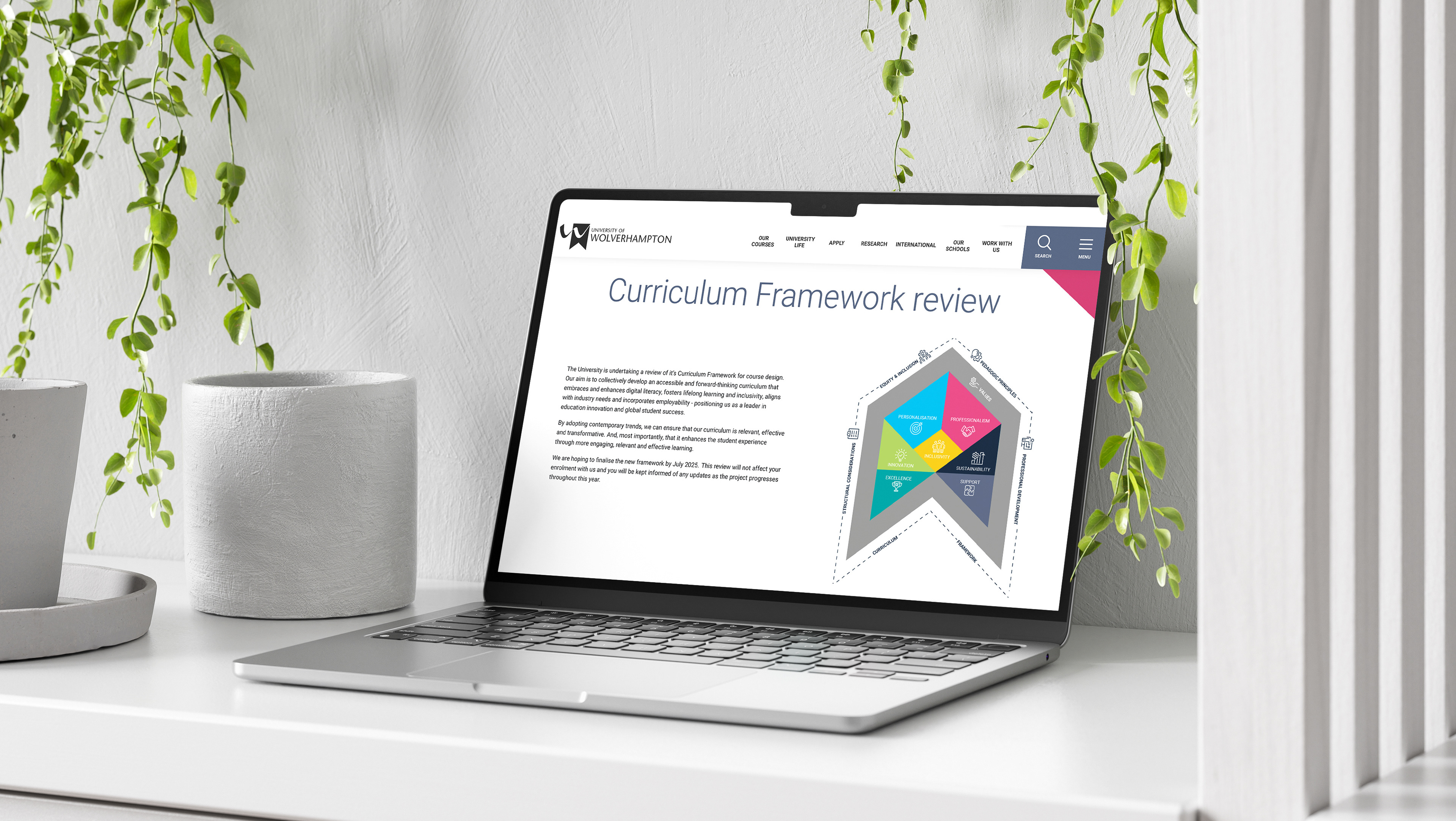
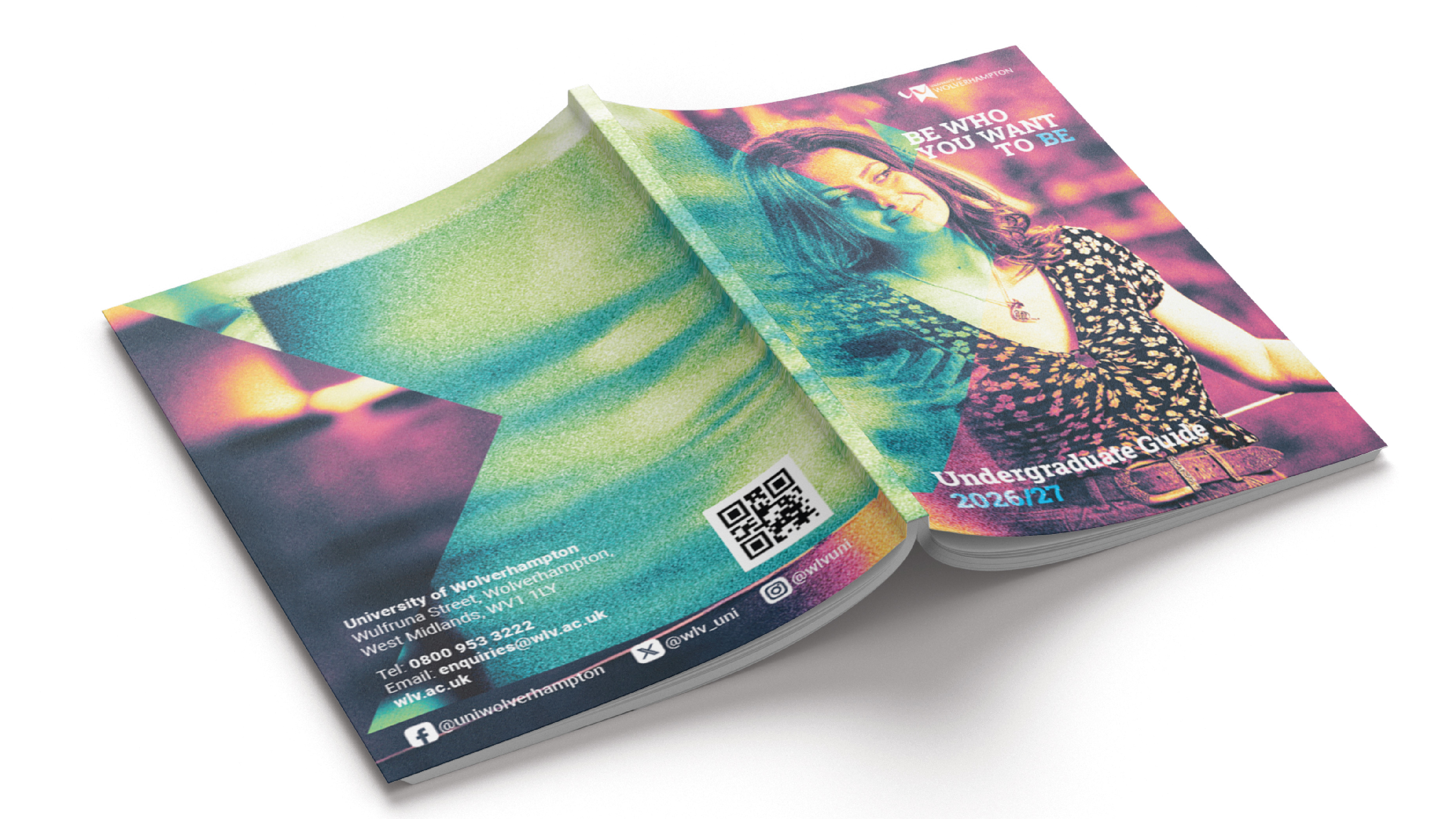
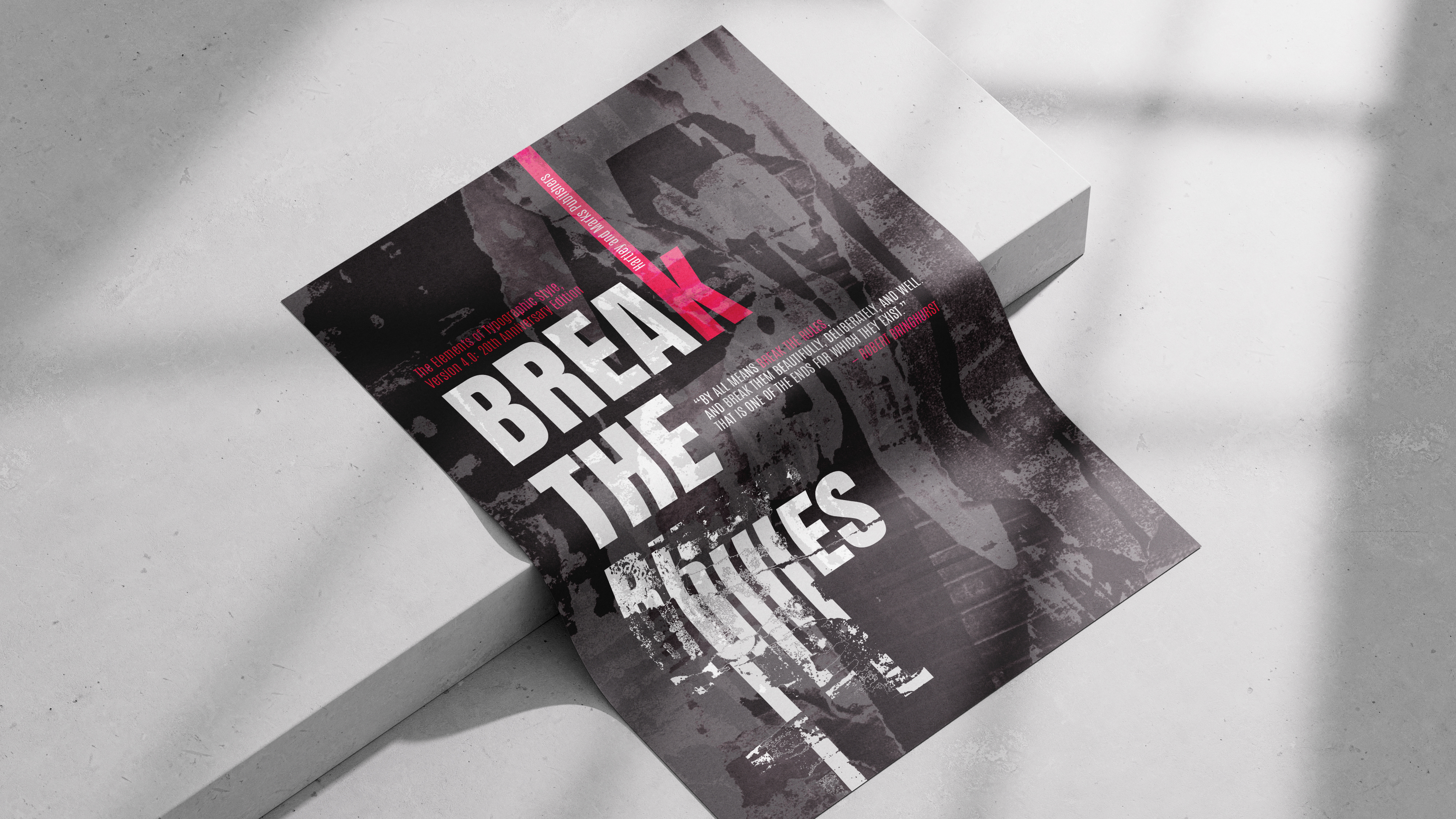
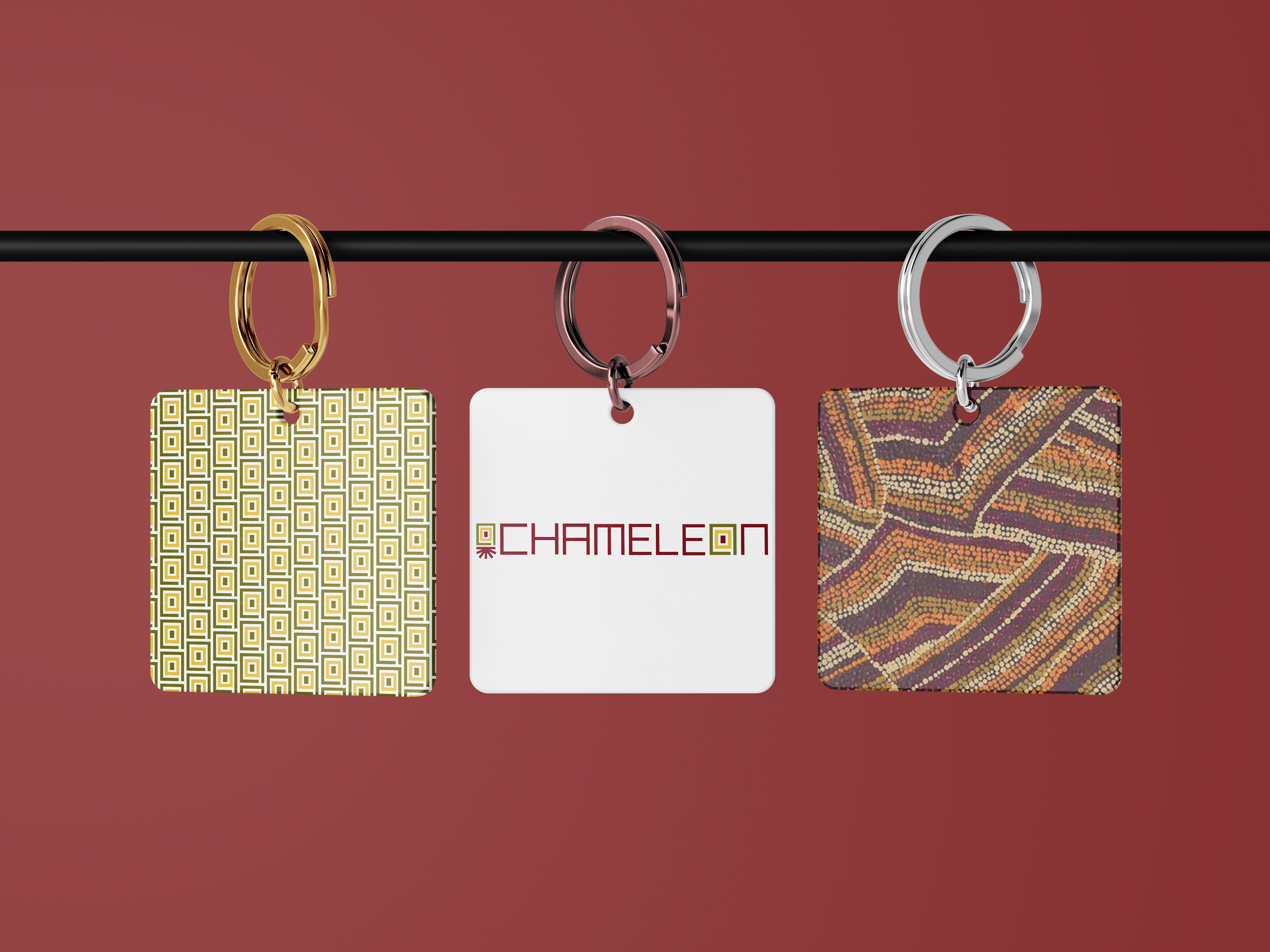
I also developed contextual mock-ups to explore the logo’s functionality across various touch points, digital platforms, printed materials, signage, and merchandise, demonstrating its versatility and clarity in both full colour and monochrome formats.
Throughout this project, it deepened my understanding of the local context, allowing me to create an identity that resonates meaningfully with its environment while remaining accessible and modern for international audiences. The challenge of integrating symbolism into both icon and type pushed my skills in custom type design and cultural sensitivity in branding. This project not only strengthened my branding process, from research to final delivery but also reinforced the importance of thoughtful cultural storytelling in design.