Editorial | Branding
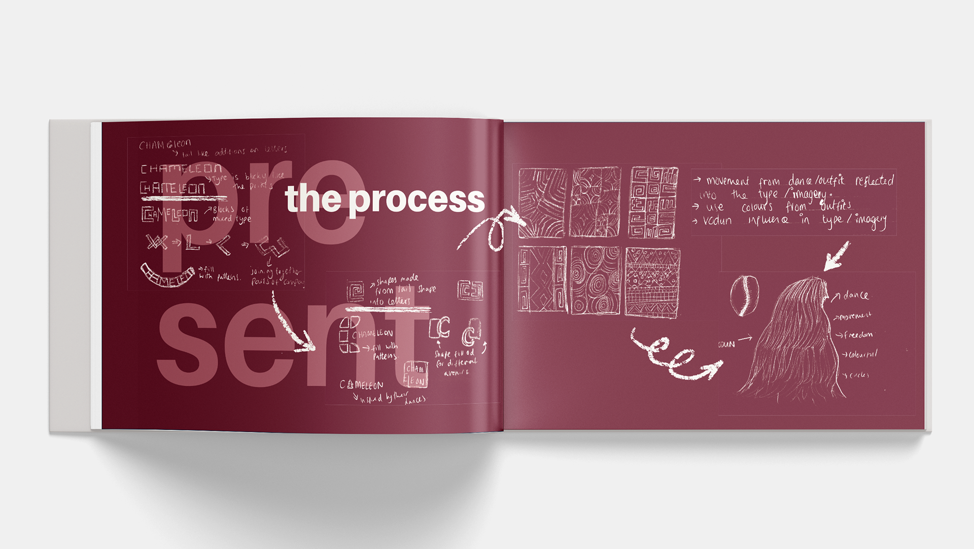
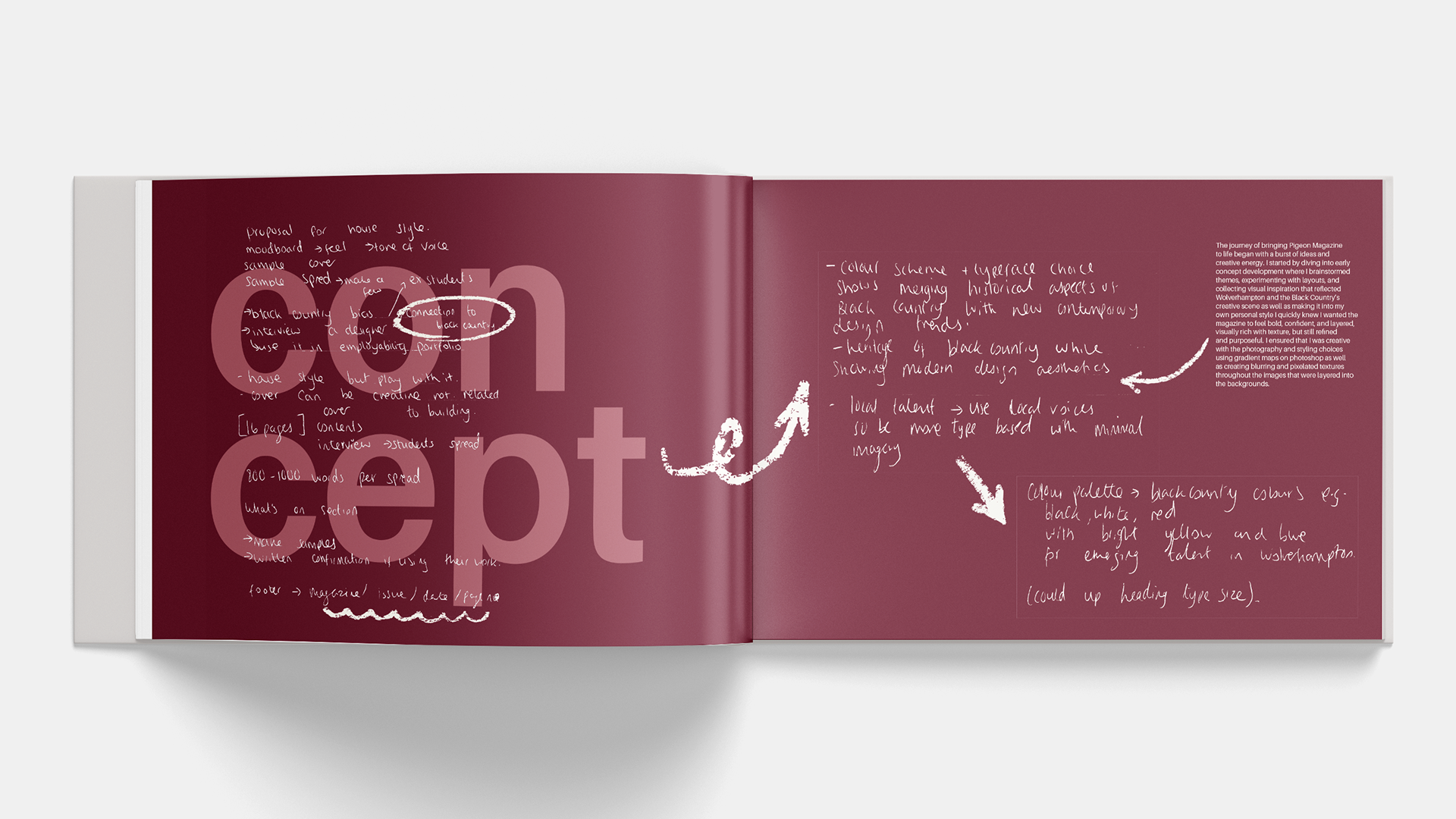
The current era of graphic design, explored in my second year essay. After completing my written essay on the current era of graphic design, I began translating it into a visually engaging editorial format. The theme of my essay, juxtaposing minimalism and maximalism, guided both the content and the design process. I researched a range of editorial layouts and contemporary design trends, creating mood boards to explore visual approaches, type treatments, and colour palettes that reflect this contrast.
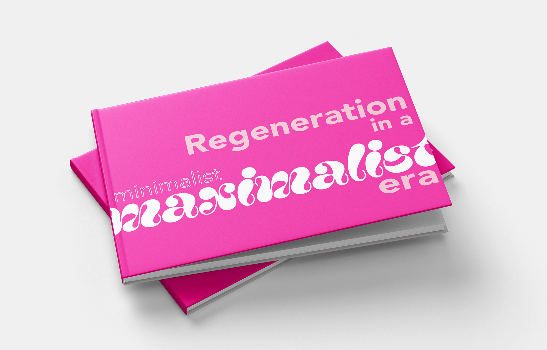
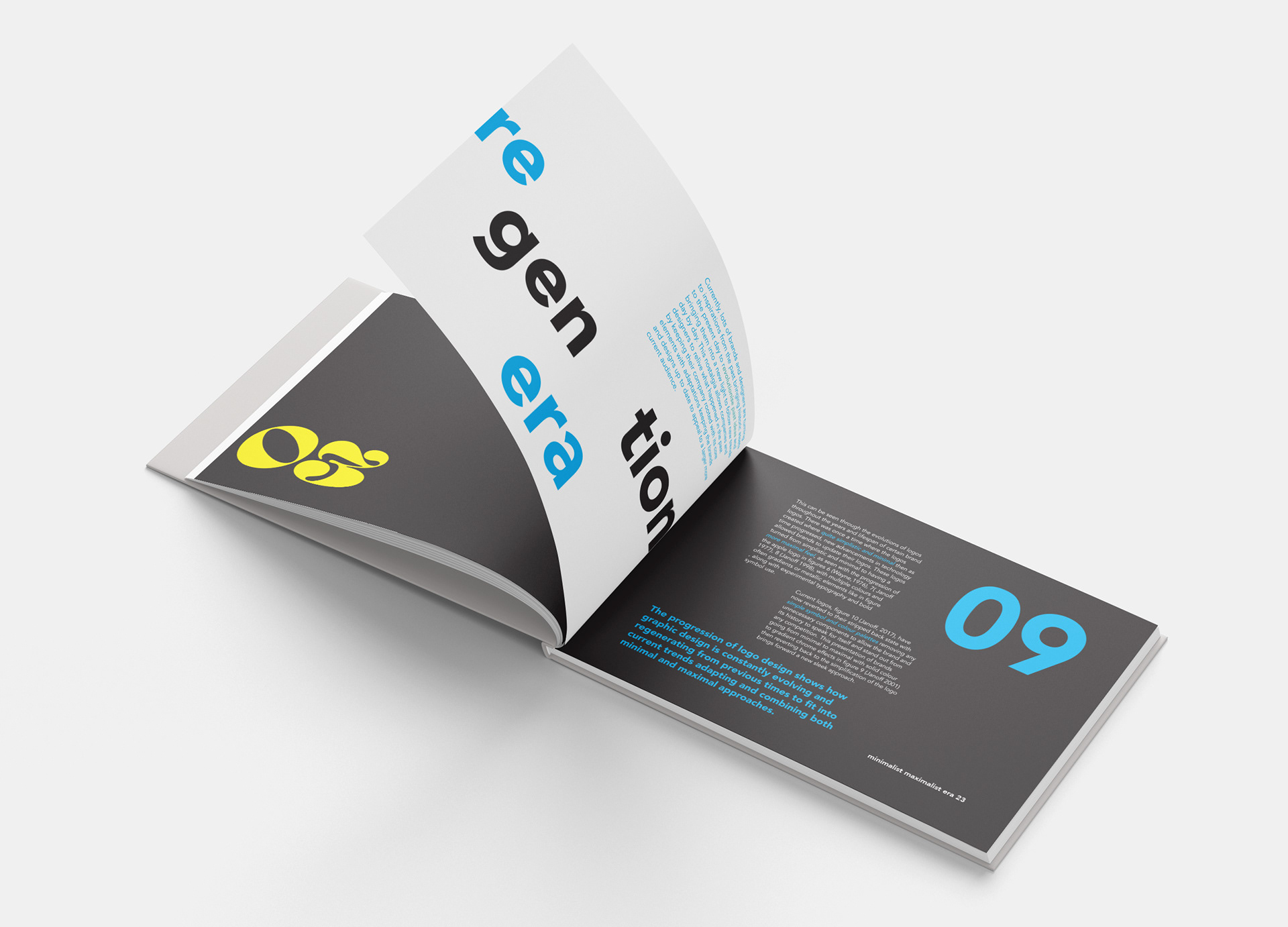
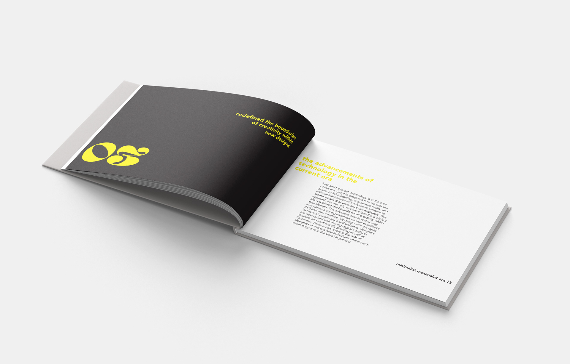
I decided to look into minimalism and maximalism and how the current era of graphic design is a regeneration of both as well as new developments in design through the use of social media.
When designing my essay, I decided to make the book feature CMYK colours only as well as retaining a layout that both represented minimalist and maximalist design. A strict grid system ensured structural consistency while allowing staggered elements to convey visual rhythm. Hierarchy was carefully managed through type size, weight, and alignment, clearly separating headings, body text, quotes, and pull-out content. This layering effect enhanced the maximalist dimension, allowing certain text and elements to appear more prominent while adding depth and texture to the layout.
This project deepened my understanding of the technical challenges in print design, especially around legibility, alignment, and paper interaction. I learned to test print regularly, checking how colours rendered off-screen and adjusting for ink density and paper absorption. These hands on experiences have made me more confident in designing for print, understanding the importance of paper stock, texture, and accurate colour output. Ultimately, this project allowed me to transform my written piece into a tactile, visually immersive experience reflecting both the thematic tension of minimalism, maximalism and the evolving nature of graphic design today.
