Poster | Campaign
Typography rules are twisted and 'broken' in this poster from my second year poster a week brief.
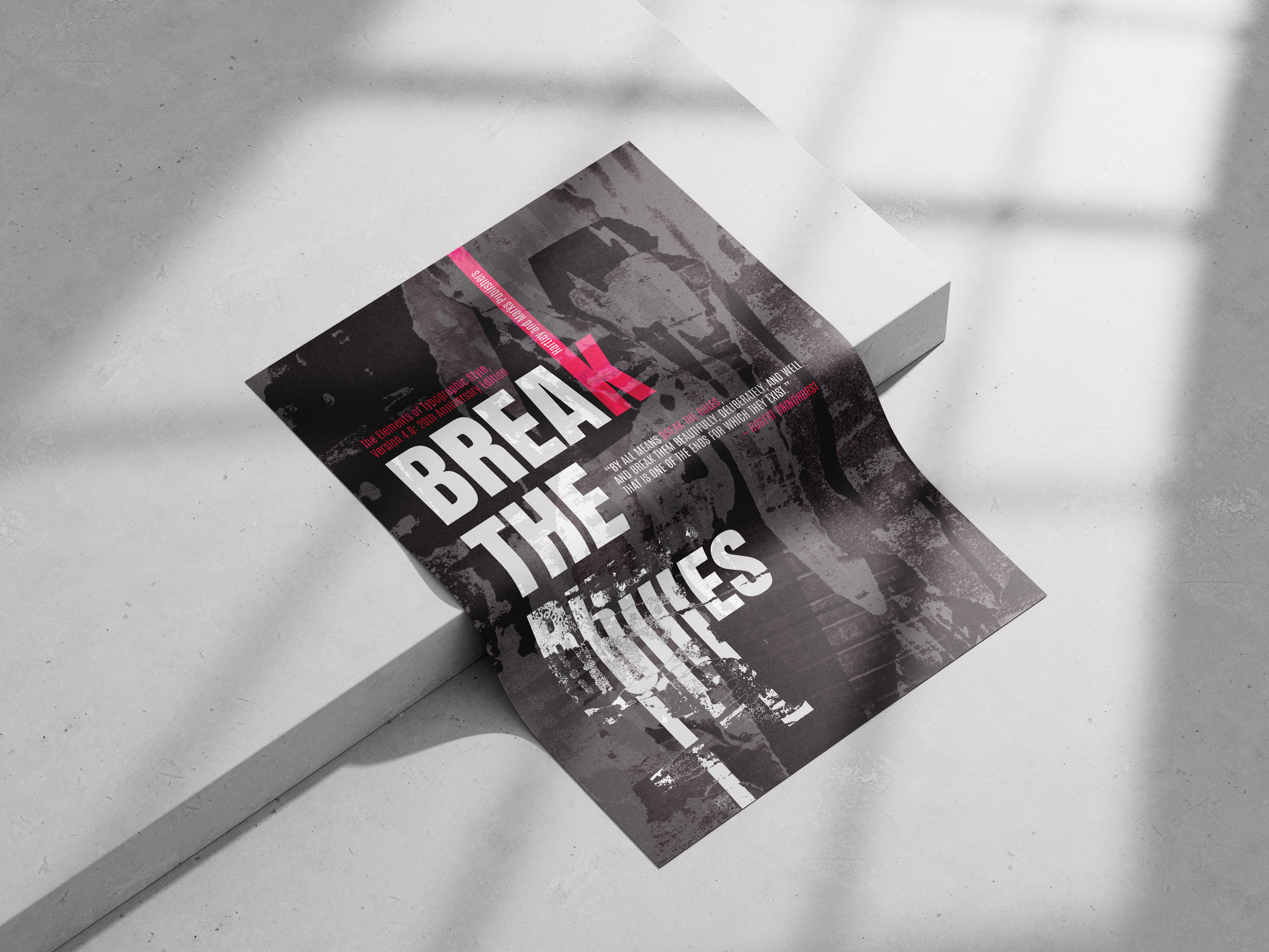
For this project, I created an A0 poster based on the theme Break the Rules. My concept was to visually represent the idea of breaking the conventions of typography itself, specifically by deconstructing and distorting the word rules. In contrast, the supporting text, break the, was kept structured and legible to maintain clear typographic hierarchy, reinforcing the concept by visually following the rules of good type design, while rules itself defied them. Following feedback, I introduced rotated elements into the layout, causing parts of the text to deviate from traditional horizontal reading patterns. This further emphasised the theme of rule-breaking while adding tension and dynamism to the composition.
This project gave me valuable insight into balancing chaos and control within a design, experimenting with texture, distortion, and hierarchy while ensuring that the overall message remained clear and impactful.